What’s in a Name (and logo!)
Why the new look? The Team Services rebranding reflects the immense growth we’ve experienced over the years. If you’re familiar with Team Services and a long time part of our family, you’ve seen us grow immensely over the years. And with that change is an opportunity for growth not only in the services we provide, areas we operate, number of employees and people we serve, but as a brand that is recognized and continuously respected in the industry.
At Team Services, we’ve always believed in the power of safety, seamless integration, and exceptional training to drive success in marine logistics, facilities management, and offshore operations. As we’ve expanded our capabilities and strengthened our partnerships, we recognized the need for a brand identity that better captures who we are today and where we’re headed tomorrow.
Rebranding wasn’t just about refreshing our look—it was about honoring our legacy while positioning ourselves for the future. Here’s the story behind why we rebranded and the significance of our new logo.
Why Team Services Rebranding Was Needed
When Team Services was founded in 2007, we started with a clear purpose: to deliver safe, reliable, and seamless operations across the Gulf Coast. Over time, we expanded our services, developed proprietary training programs, and cultivated long-term relationships with clients across multiple industries. What began as a company rooted in marine services grew to include facility management, rail operations, and product handling logistics.
However, as we grew, so did the need for a brand identity that captured the full scope of what we offer. Feedback from clients and industry leaders revealed that while our operations were widely respected, our identity didn’t reflect the full potential of our capabilities. We knew it was time for a rebrand that would represent who we are today—and where we’re headed.
Our new brand identity aims to:
- Attract larger bid opportunities with key brands.
- Strengthen direct relationships with industry decision-makers.
- Improve recruiting efforts by showcasing our company’s growth and culture.
In short, this transformation allows us to expand our impact across the industries we serve while staying true to the values that brought us here.
What the New Logo Represents
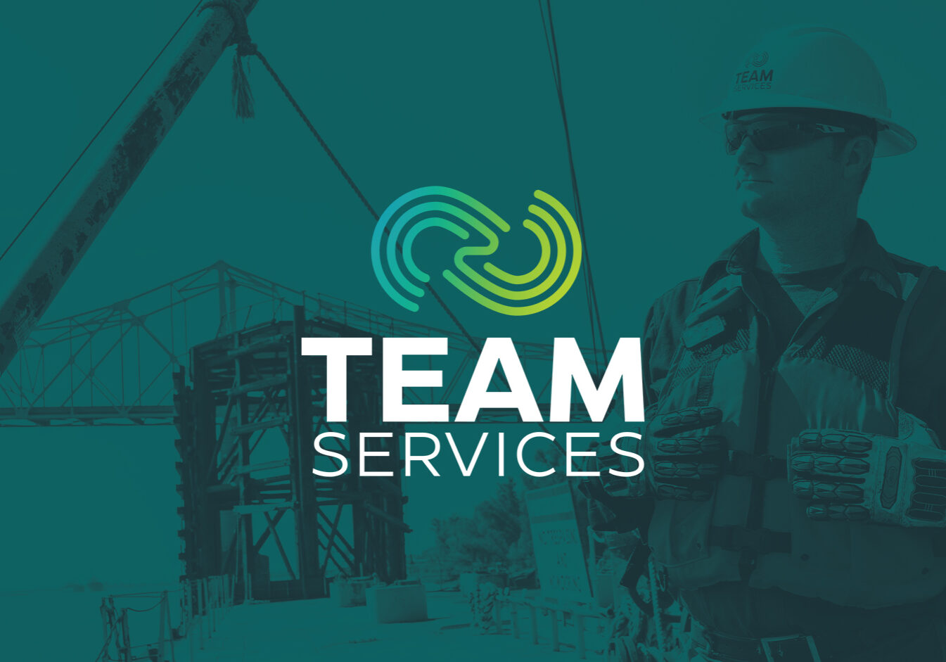
At the heart of our rebrand is our new logo—a modern, abstract infinity symbol. More than just a design, this symbol embodies the limitless potential of what Team Services offers. Here’s what it stands for:
- Seamless Integration: The flowing, continuous design reflects how we integrate with our clients’ operations, delivering efficiency and peace of mind.
- Total Teamwork: The logo’s interwoven elements represent the collaboration that defines everything we do—from working alongside our partners to building internal cohesion.
- Limitless Growth: The infinity shape serves as a reminder that the possibilities for innovation and success are endless when you focus on doing things the right way.
Looking Forward After Team Services Rebranding
This rebrand isn’t about leaving the past behind—it’s about building on a legacy of excellence established over decades. While the new logo and website reflect a fresh, forward-looking identity, they’re rooted in the same principles that have guided us since day one: safety, operational excellence, and training.
Our vision is to continue growing while remaining a trusted partner for marine logistics, facilities management, and offshore operations. Whether you’re a client seeking a vendor you can trust or a professional looking to join a company with strong values, we invite you to explore what Team Services has to offer.
We’re proud of where we’ve been, excited about where we’re headed, and ready to take the next steps—together.
For more about our transformation and the inspiration behind our new look, visit our website at teamserv.com.


